
EVENTR
A transformation of Eventr's itinerary view to modernise design, captivate users and enhance the overall experience.
Timeline
January 2023 - Present
My Role
UX/UI Designer — Research, Testing, Visual Design, Interaction Design, Prototyping
Overview
The Eventr mobile app is the spearhead in an all-new set of user-focused digital products designed to enhance team travel. From family holidays to multinational sporting events, Eventr simplifies the complexity of handling large groups through a dynamic itinerary system, ensuring everyone remains in the loop throughout.
Skills Developed
Figma
Adobe Illustrator
Wireframing
UI design for mobile, web and watch
Prototyping and animation
Usability testing
Research, Flows and Journey Maps
Systematic team organisation
Communication with clients, developers and POs
Challenge
Eventr's existing itinerary view interface presents a significant challenge. It falls short of modern design standards and fails to captivate both prospective and current users. The lack of engagement in the current design not only diminishes the platform's visual appeal but also jeopardises the overall user experience.
Goals
Implement a modern and visually appealing design language by utilising contemporary UI elements and design principles.
Introduce interactive elements to make the itinerary view more engaging.
Ensure a user-friendly hierarchy that guides users through their travel plans seamlessly.
RESEARCH
Diving into the digital travel solution industry.
Primary Research
This phase involved engaging directly with users and organisations who were currently utilising their own systems or alternative solutions. Our aim was to gain deep insights into their experiences, identify pain points and discern their unmet needs.
We also meticulously evaluated other applications currently available in the market. Our objective was to assess their strengths and weaknesses through testing scenarios.

A well established travel organisation platform for travel plans, facilitating easy sharing of itineraries. While it excels in many areas, it lacks a modern UI and the ability to control your own itinerary, deal with teams, and have multiple itineraries.

Wanderlog is a travel planning app known for its collaborative features and modern interface. However, we found that the interface very compact and complex, making the experience feel very intense.

The business standard for travel budgeting, with some focus on itinerary planning, but more focused on expenses. A very dated system that no one seems to use or like. Provided great lessons on what NOT to do.

A travel Agent to customer itinerary management system for a single user. Offers close to nothing without a travel agent, no team integration. However, a very simple and user friendly interface to draw inspiration from.

A corporate travel and expense management platform. Great app UI, website and all round experience, clearly very well established and trusted. A level to aim for.

Sabre GDS booking app designed for business, but almost too much for business. Very plain, very boring, and very outdated. Not much to draw from here.
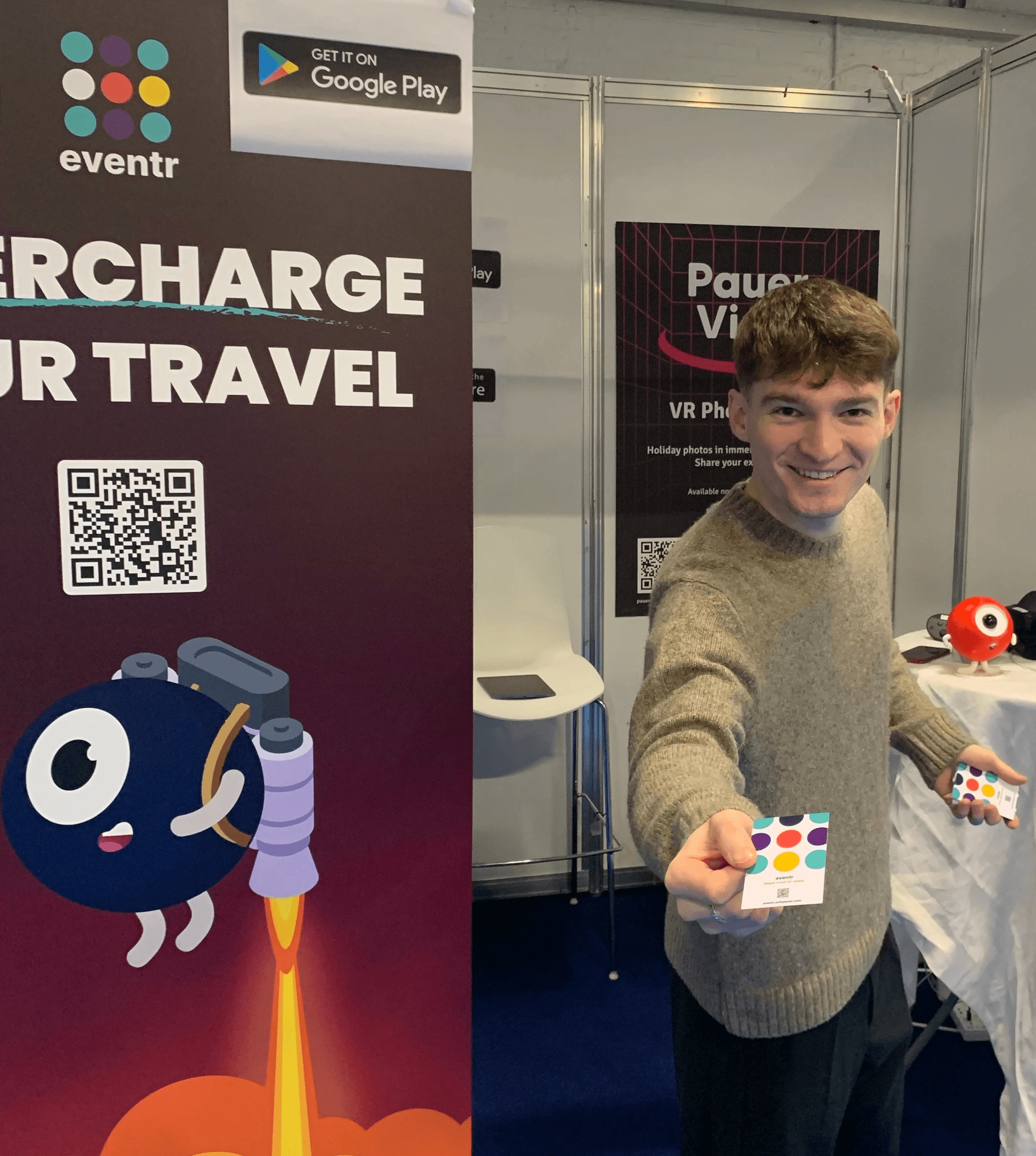
We also attended Destinations: The Holiday & Travel Show in London prior to Eventr's V2's development. The purpose of this was to interact directly with potential users to get a better understand of our target audience and gain insights into their wants and needs. It also acted as a pretty good stage to create some brand awareness and grow our network.
Secondary Research
By diving into the insights shared by users on online forums and app stores, we gained a greater understanding of the market and current solutions.

Trip Plans

"The collaborative planning was a buggy letdown."

Wanderlog
"Not user friendly. Bad support. Calendar/Itinerary is clunky and worthless."

TripIt
r/TripIt
"It often fails to recognise my reservation details correctly, creating a lot more work for me than promised."

SAP Concur

"Their mobile app has a steep learning curve. It took me a while to figure out how to use it effectively."
Wanderlog
"The premium features are overpriced for what you get. I expected more."
TripIt
"I found TripIt confusing to use. The interface isn't very user-friendly, and it didn't sync my travel plans correctly."
Wanderlog
"The offline access feature is unreliable. I had issues accessing my itineraries during my travels."
Navan
r/TravelHacks
"I’ve had issues with Navan not categorising my expenses correctly and it’s led to a lot of manual work."
Research Conclusions
Pain Points
Complex organisation processes
Disorganised documents
Communication gaps
Limited real-time updates
Poor collaboration
App switching
Causes
Incomplete and inefficient apps
Lack of functionality
Absence of travel provider integration
Inadequate collaborative features
Reliance on multiple tools
Solution
A comprehensive app that consolidates collaborative travel-related tasks within a single, user-friendly space.
TARGET AUDIENCE
Fingerprinting our users.
The Creator
Operations Manager
"My sole role is to plan and organise large international travel operations for around 50-100 personnel."
The Organiser
Family Trip Planner
"I want to organise a holiday for my family of 4 and I want everyone to stay up to date with the plans."
The Follower
Passive User
"I'm going on holiday with a group. I'm not involved with the organising, but I still want to know what's happening."
Needs
Comprehensive data management
Seamless team communication
A solution for mobile and desktop
A simple way to make quick plan alterations
Less time spent on admin to maximise enjoyment
A space for collaboration
Flexibility to change plans quickly
Reminders and notifications
Accessibility and convenience
Clarity in communication
Access to collaboration features
Frustrations
Gathering and organising a vast amount of data
Coordinating with team members when making changes or updates
Lost or fragmented information
Reliance on multiple tools
Multiple and scattered travel documents
App switching
Tracking costings
Poor sharing and viewing capabilities
Tardiness and losing group members
Limited accessibility
Communication gaps
Feeling left out of the planning process
Reliance on multiple tools
EVENTR V1
A quick look at where Eventr was.
THE DESIGN PROCESS
From sketch to screen.
User Persona
User Journey Map
Ideation
Wireframes
V2 FINAL EXECUTION
A new direction for Eventr.
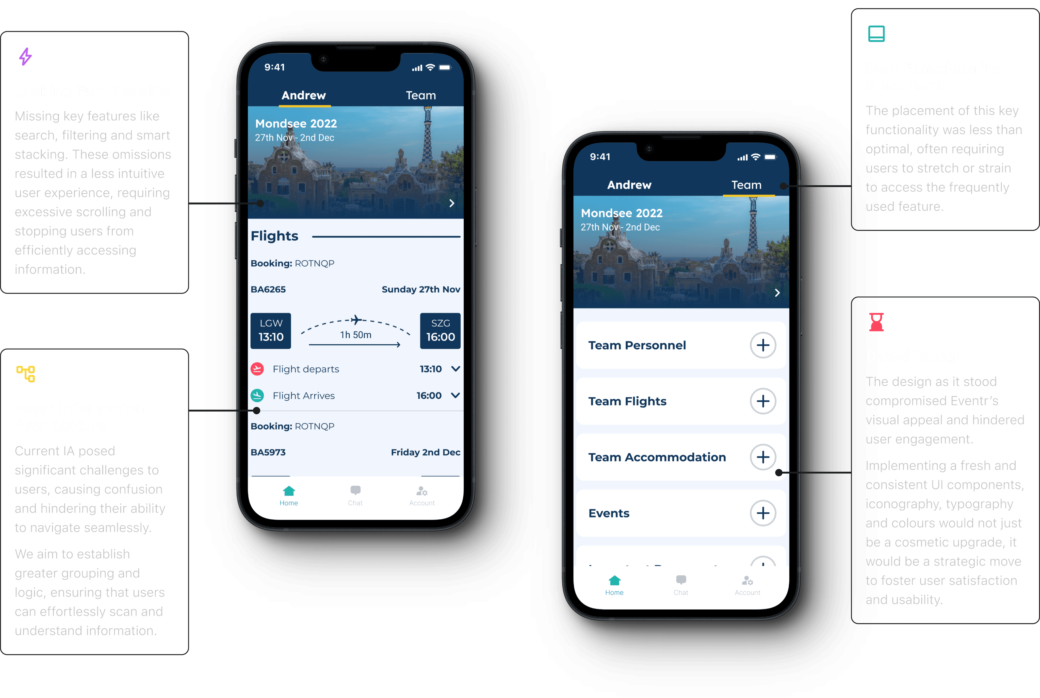
A Modernised UI to Increase Engagement
We undertook a substantial modernisation of Eventr's UI. Recognising that the existing design compromised the platform's visual appeal and hindered user engagement, we implemented a contemporary and consistent design language. This involved overhauling UI components, refining iconography, optimising typography and introducing a refreshed colour palette.
Beyond aesthetics, this strategic upgrade was a pivotal move to enhance both user satisfaction and overall usability. The result is a transformation that aligns with current design standards, fostering a more engaging and satisfying user experience.
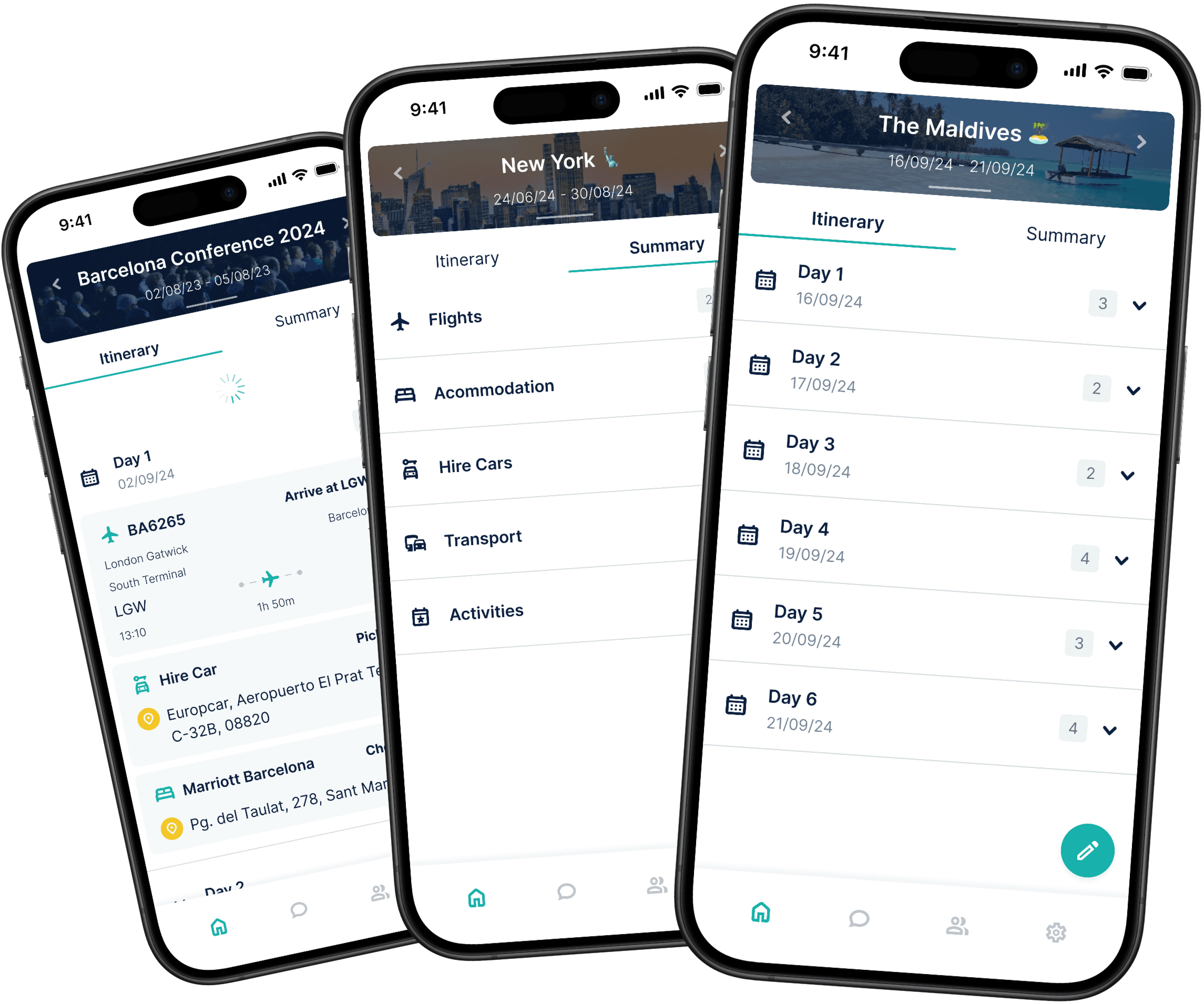
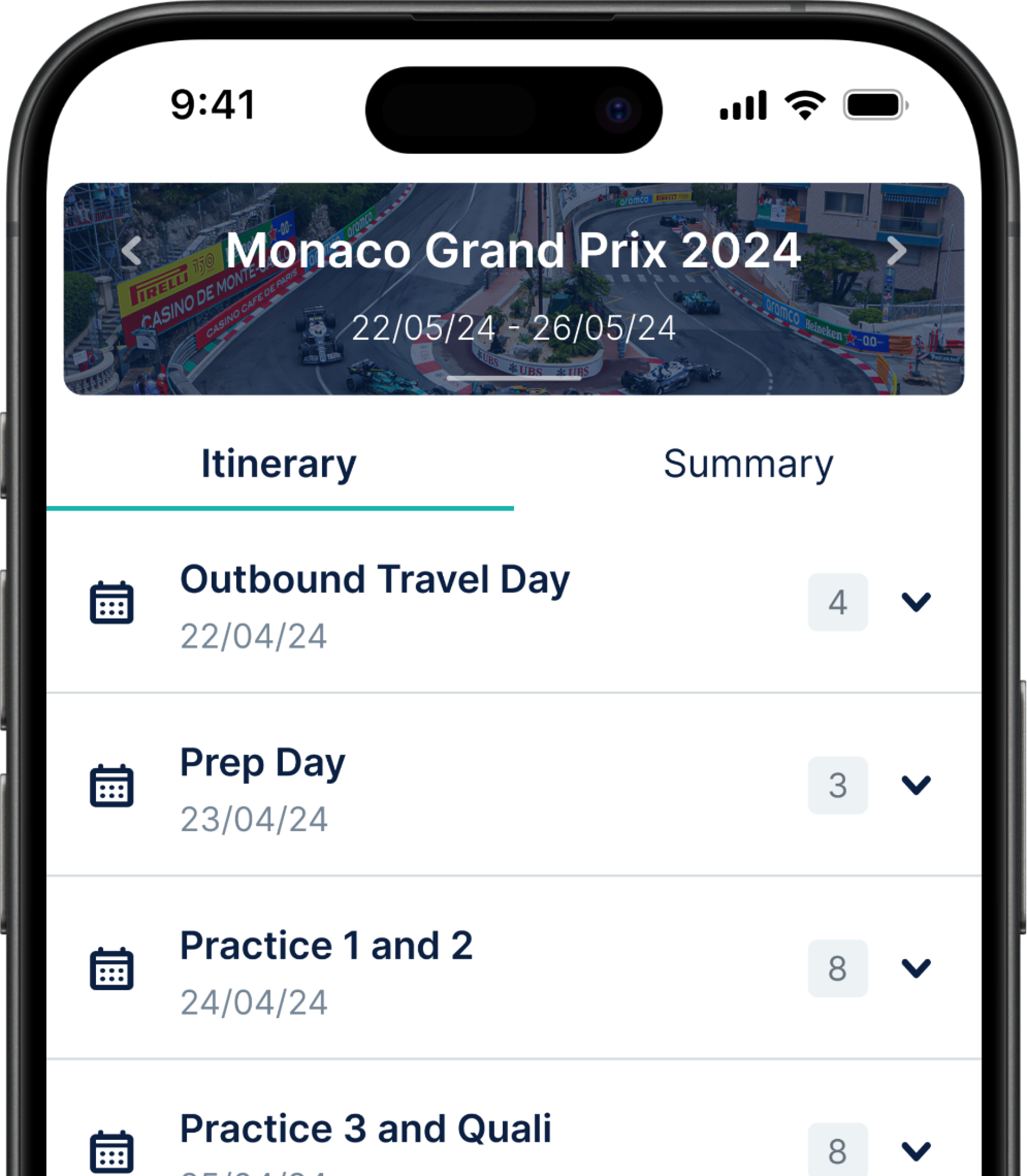
Dynamic Itinerary Selector
At the heart of the transformation lies the dynamic itinerary selector, a component that completely changes the user's interaction with the app. It serves as the focal point of the UI, displaying essential details such as itinerary names and dates right from the get-go. Furthermore, to personalise the experience, users can select a custom or default cover image from our integrated gallery.
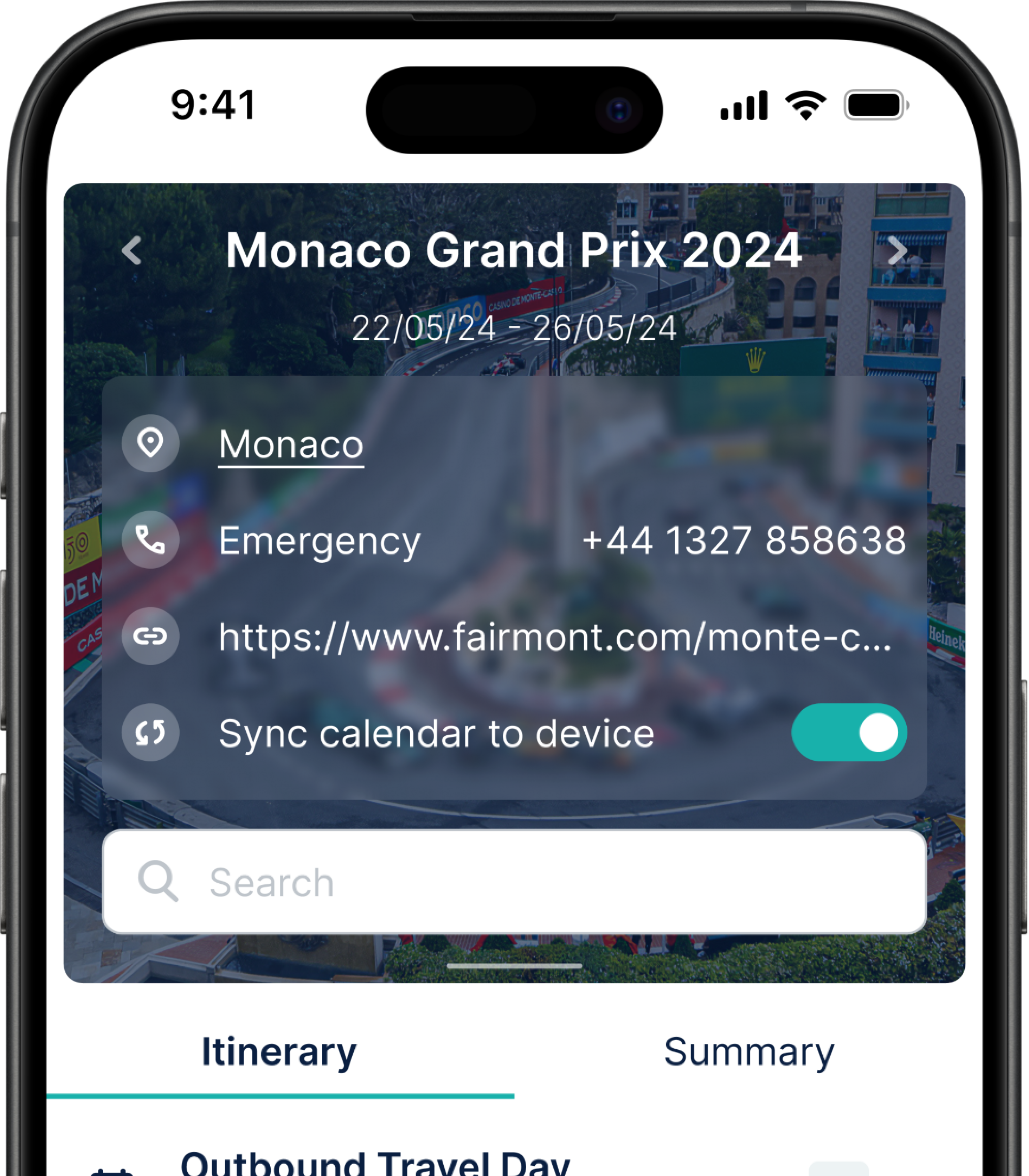
The itinerary selector is also a powerhouse of functionality, enabling users to swiftly switch between itineraries with a simple left or right swipe, or uncover important general information regarding the itinerary by swiping down. The introduction of a search functionality ensures easy itinerary entry or user discoverability.
But we didn't stop there. Recognising the importance of integration, we implemented a "sync calendar to device" function. Now, users can effortlessly add their itineraries to their native calendars, syncing their Eventr plans with their daily lives.
Itinerary View
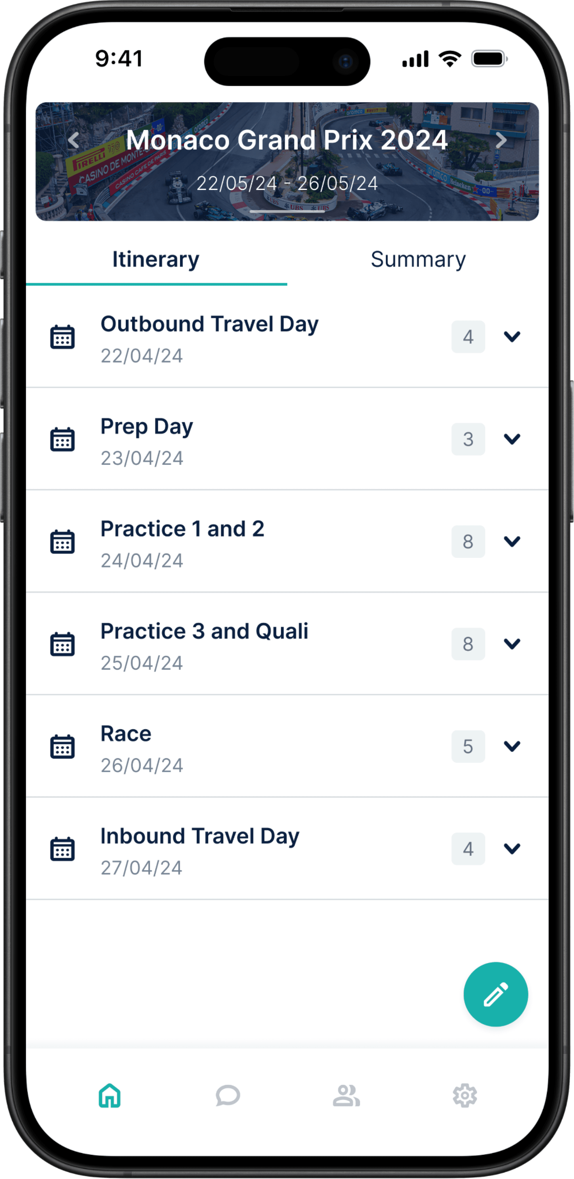
We've reimagined the itinerary view, tuning it to be more personalised and easy to navigate. By default, users are greeted with a chronological breakdown of their itinerary days, ensuring clarity as the schedule unfolds. The customisation comes into play as users can assign names to each day.
Neatness and accessibility are at the forefront, with itinerary entries smartly organised within their respective date drop-downs. Tapping on an entry reveals a wealth of information and functionality. Users not only get a comprehensive overview of who from their team is part of the entry, but also access additional details such as attachments and notes. This approach avoids clutter, creating a clear and organised itinerary view.
For those looking to edit details or initiate a discussion, direct access points to edit the entry and entry-specific chat are seamlessly integrated.
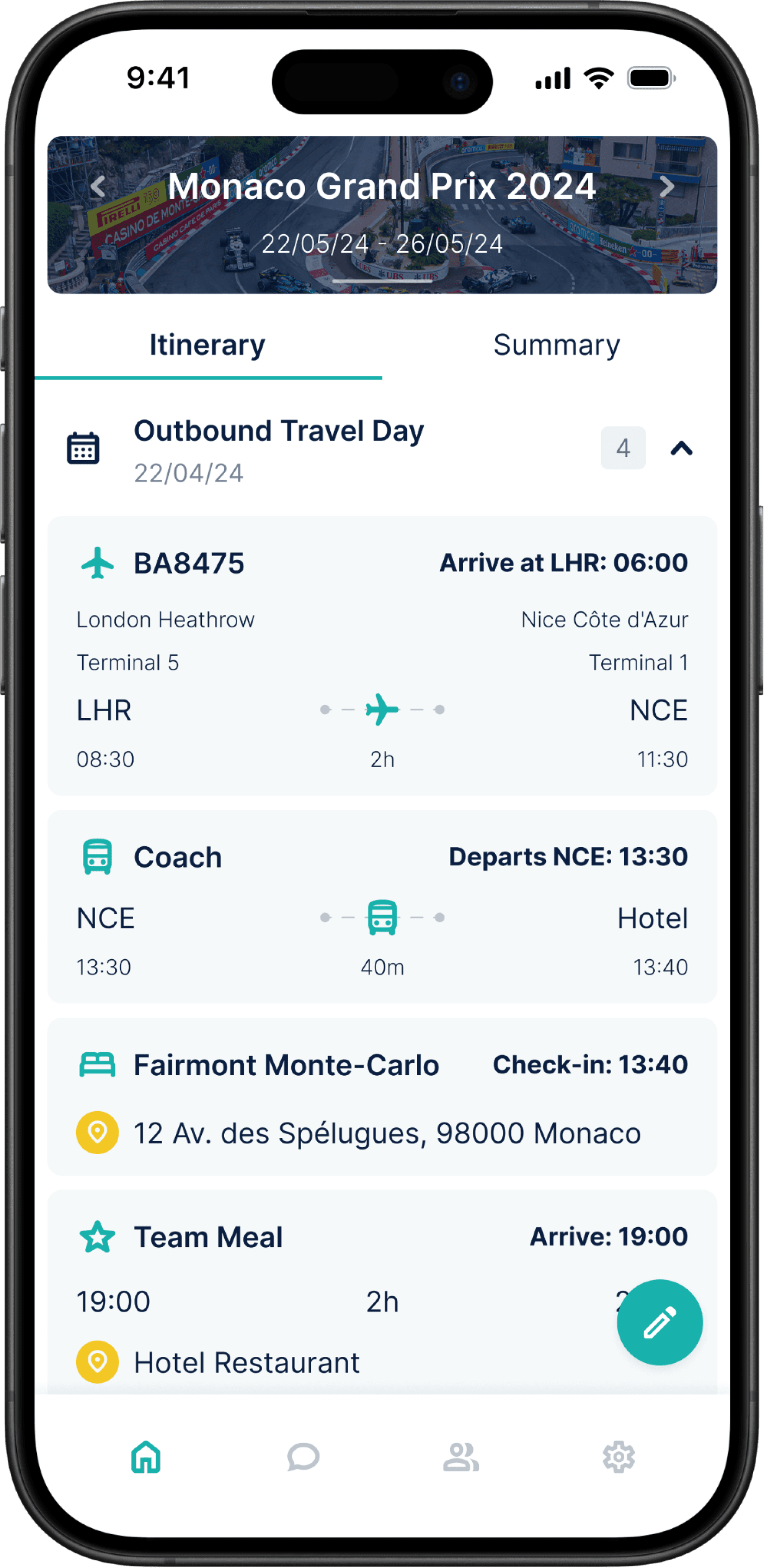
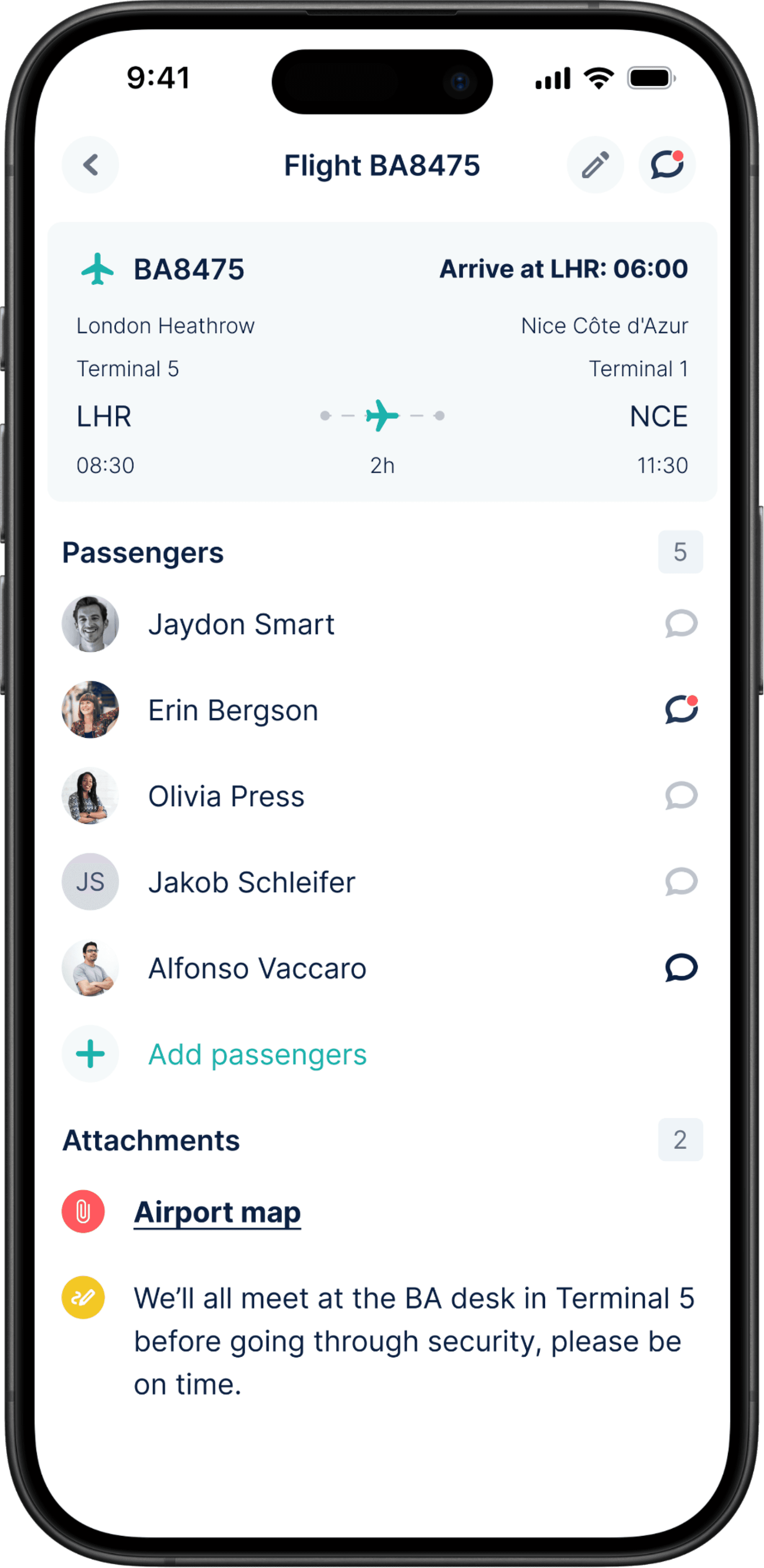
Itinerary Cards
In our quest to enhance clarity and usability, each itinerary entry now boasts its own distinctive card. This redesign brings a new level of definition to each entry, ensuring users can easily navigate and engage with their travel plans.
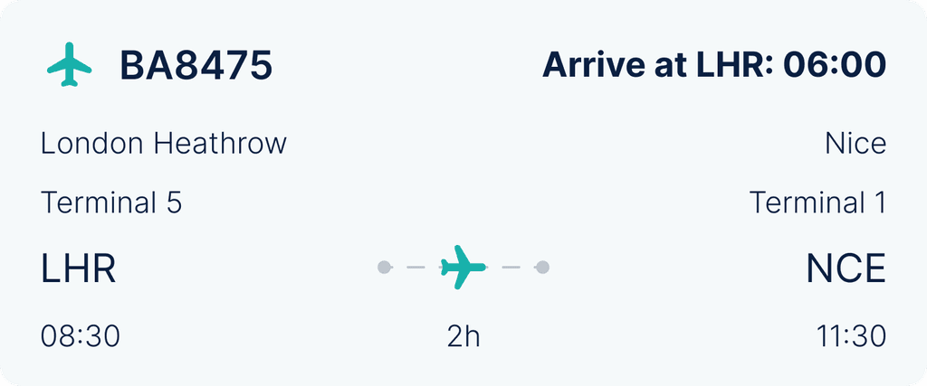
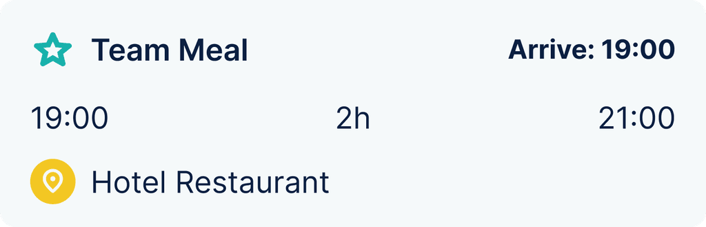
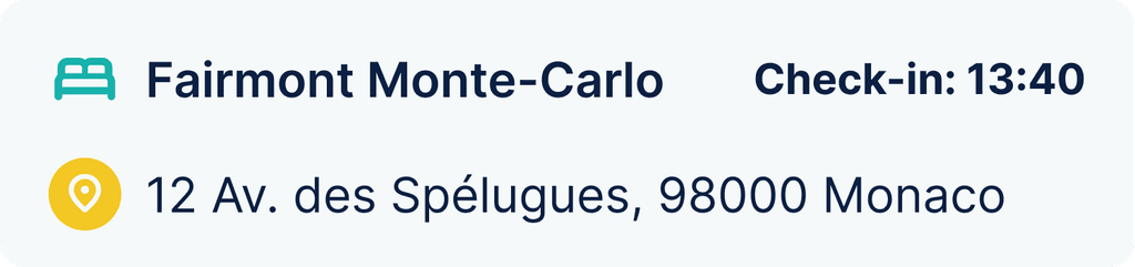
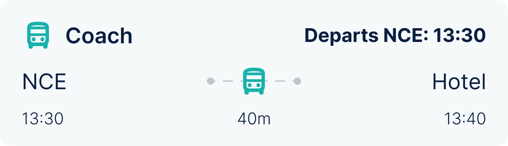
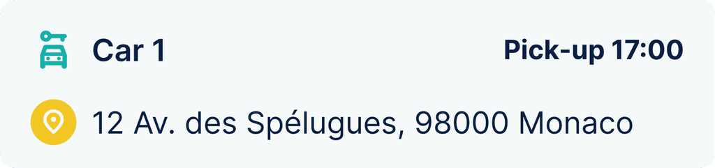
The introduction of dynamic flight cards, integrating live flight data, adds a layer of real-time convenience. Beyond flights, we've implemented purpose-specific cards for activities, accommodations, transport, and hire cars. These cards prioritise crucial information such as names, locations, and times, delivering an at-a-glance understanding of the itinerary.
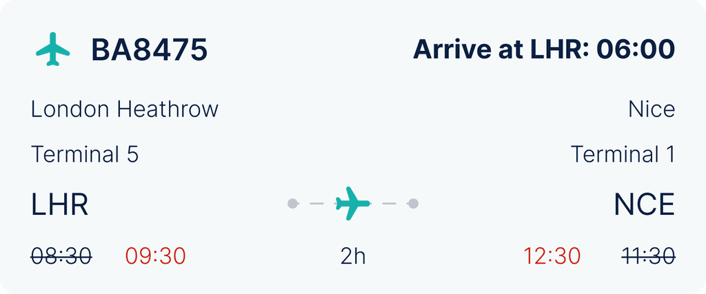
The top right corner of each card hosts a dynamic action reminder, a game-changer in itinerary management. The entry creator can set reminders for key actions, creating a seamless chronological display. For example, flight-related reminders can include check-in, arrive at the airport, boarding, takeoff and landing times, offering users an organised approach to their travel journey.
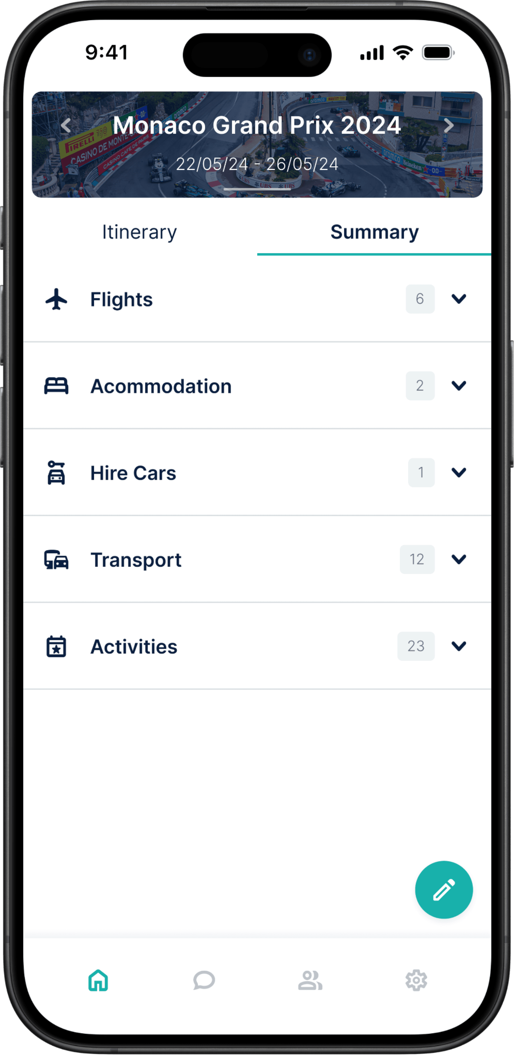
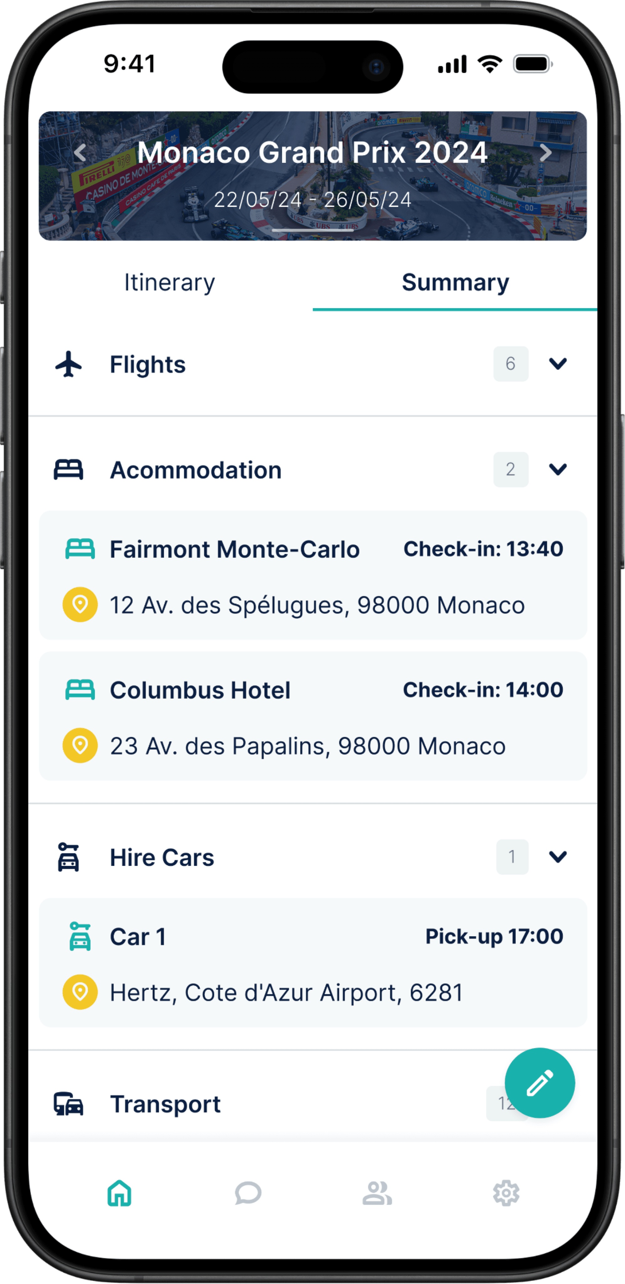
Summary View
Positioned within the view selector beneath the itinerary switcher, summary view enables users to tailor their itinerary display to their preference.
Summary view allows users to organise their plans based on entry categories. By simply toggling to this mode, users can focus on specific aspects of their itinerary with ease. This alternate viewing option adds a layer of flexibility, providing users with a different approach to accessing and navigating their travel plans.
RESULTS
how to Look backwards to go forwards.
Elevated Visuals
We successfully implemented a modernised design language, upgrading Eventr with contemporary UI elements and principles. The result is a modern and visually appealing interface that enhances the platform's overall aesthetic and user experience.
Engaging Interactivity
With the introduction of interactive elements, we've transformed the itinerary view into an engaging and dynamic space. Users can now seamlessly interact with their travel plans, fostering a more immersive and enjoyable experience.
Seamless Navigation
Eventr's user-friendly hierarchy now provides a clear and intuitive path through travel plans. Navigating itineraries has become a seamless experience, guiding users effortlessly and ensuring they can access the information they need with ease.
What's Next?
As we wrapped up Eventr V2, it was an opportune moment to plan Eventr's future.
Our assessment concluded that Eventr will be an ever-evolving project, adapting to user feedback and the fluctuating travel and technology industries. This ongoing development ensures the product aligns closely with user preferences and industry trends, offering a tool that has a positive impact on travel experiences.
With the core application optimised, our focus shifted to enhancing other facets of Eventr, including the Coordinator Hub and additional add-ons that complement the application's functionality.
Next Project

EVENTR
A transformation of Eventr's itinerary view to modernise design, captivate users and enhance the overall experience.
Timeline
January 2023 - Present
My Role
UX/UI Designer — Research, Testing, Visual Design, Interaction Design, Prototyping
Overview
The Eventr mobile app is the spearhead in an all-new set of user-focused digital products designed to enhance team travel. From family holidays to multinational sporting events, Eventr simplifies the complexity of handling large groups through a dynamic itinerary system, ensuring everyone remains in the loop throughout.
Skills Developed
Figma
Adobe Illustrator
Wireframing
UI design for mobile, web and watch
Prototyping and animation
Usability testing
Research, Flows and Journey Maps
Systematic team organisation
Communication with clients, developers and POs
Challenge
Eventr's existing itinerary view interface presents a significant challenge. It falls short of modern design standards and fails to captivate both prospective and current users. The lack of engagement in the current design not only diminishes the platform's visual appeal but also jeopardises the overall user experience.
Goals
Implement a modern and visually appealing design language by utilising contemporary UI elements and design principles.
Introduce interactive elements to make the itinerary view more engaging.
Ensure a user-friendly hierarchy that guides users through their travel plans seamlessly.
RESEARCH
Diving into the digital travel solution industry.
Primary Research
This phase involved engaging directly with users and organisations who were currently utilising their own systems or alternative solutions. Our aim was to gain deep insights into their experiences, identify pain points and discern their unmet needs.
We also meticulously evaluated other applications currently available in the market. Our objective was to assess their strengths and weaknesses through testing scenarios.
A well established travel organisation platform for travel plans, facilitating easy sharing of itineraries. While it excels in many areas, it lacks a modern UI and the ability to control your own itinerary, deal with teams, and have multiple itineraries.
Wanderlog is a travel planning app known for its collaborative features and modern interface. However, we found that the interface very compact and complex, making the experience feel very intense.
The business standard for travel budgeting, with some focus on itinerary planning, but more focused on expenses. A very dated system that no one seems to use or like. Provided great lessons on what NOT to do.
A travel Agent to customer itinerary management system for a single user. Offers close to nothing without a travel agent, no team integration. However, a very simple and user friendly interface to draw inspiration from.
A corporate travel and expense management platform. Great app UI, website and all round experience, clearly very well established and trusted. A level to aim for.
Sabre GDS booking app designed for business, but almost too much for business. Very plain, very boring, and very outdated. Not much to draw from here.
We also attended Destinations: The Holiday & Travel Show in London prior to Eventr's V2's development. The purpose of this was to interact directly with potential users to get a better understand of our target audience and gain insights into their wants and needs. It also acted as a pretty good stage to create some brand awareness and grow our network.
Secondary Research
By diving into the insights shared by users on online forums and app stores, we gained a greater understanding of the market and current solutions.
Trip Plans
"The collaborative planning was a buggy letdown."
Wanderlog
"Not user friendly. Bad support. Calendar/Itinerary is clunky and worthless."
TripIt
r/TripIt
"It often fails to recognise my reservation details correctly, creating a lot more work for me than promised."
SAP Concur
"Their mobile app has a steep learning curve. It took me a while to figure out how to use it effectively."
Wanderlog
"The premium features are overpriced for what you get. I expected more."
TripIt
"I found TripIt confusing to use. The interface isn't very user-friendly, and it didn't sync my travel plans correctly."
Wanderlog
"The offline access feature is unreliable. I had issues accessing my itineraries during my travels."
Navan
r/TravelHacks
"I’ve had issues with Navan not categorising my expenses correctly and it’s led to a lot of manual work."
Research Conclusions
Pain Points
Complex organisation processes
Disorganised documents
Communication gaps
Limited real-time updates
Poor collaboration
App switching
Causes
Incomplete and inefficient apps
Lack of functionality
Absence of travel provider integration
Inadequate collaborative features
Reliance on multiple tools
Solution
A comprehensive app that consolidates collaborative travel-related tasks within a single, user-friendly space.
TARGET AUDIENCE
Fingerprinting our users.
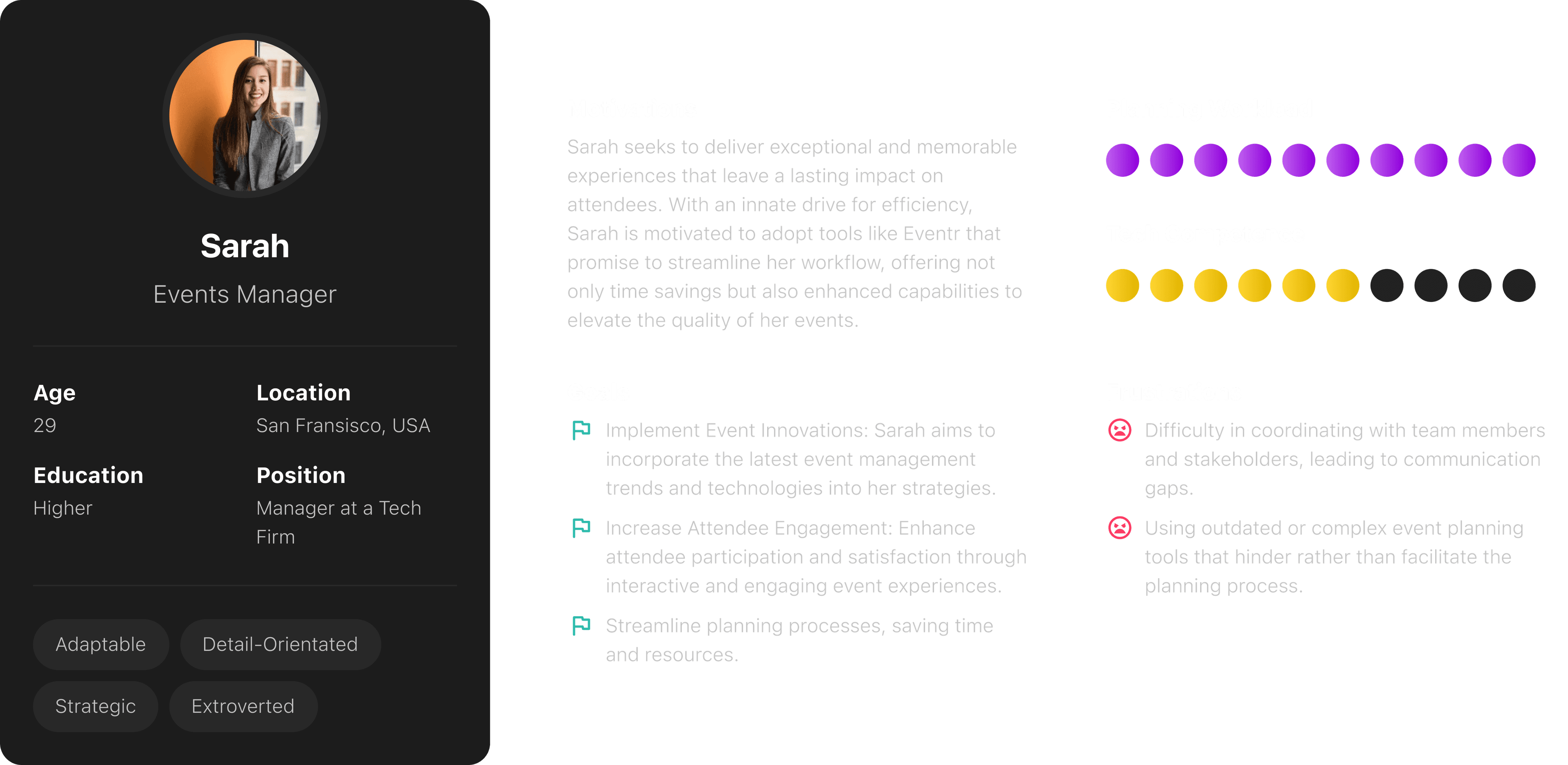
The Creator
Operations Manager
"My sole role is to plan and organise large international travel operations for around 50-100 personnel."
The Organiser
Family Trip Planner
"I want to organise a holiday for my family of 4 and I want everyone to stay up to date with the plans."
The Follower
Passive User
"I'm going on holiday with a group. I'm not involved with the organising, but I still want to know what's happening."
Needs
Comprehensive data management
Seamless team communication
A solution for mobile and desktop
A simple way to make quick plan alterations
Less time spent on admin to maximise enjoyment
A space for collaboration
Flexibility to change plans quickly
Reminders and notifications
Accessibility and convenience
Clarity in communication
Access to collaboration features
Frustrations
Gathering and organising a vast amount of data
Coordinating with team members when making changes or updates
Lost or fragmented information
Reliance on multiple tools
Multiple and scattered travel documents
App switching
Tracking costings
Poor sharing and viewing capabilities
Tardiness and losing group members
Limited accessibility
Communication gaps
Feeling left out of the planning process
Reliance on multiple tools
EVENTR V1
A quick look at where Eventr was.
THE DESIGN PROCESS
From sketch to screen.
User Persona
User Journey Map
Ideation
Wireframes
V2 FINAL EXECUTION
A new direction for Eventr.
A Modernised UI to Increase Engagement
We undertook a substantial modernisation of Eventr's UI. Recognising that the existing design compromised the platform's visual appeal and hindered user engagement, we implemented a contemporary and consistent design language. This involved overhauling UI components, refining iconography, optimising typography and introducing a refreshed colour palette.
Beyond aesthetics, this strategic upgrade was a pivotal move to enhance both user satisfaction and overall usability. The result is a transformation that aligns with current design standards, fostering a more engaging and satisfying user experience.
Dynamic Itinerary Selector
At the heart of the transformation lies the dynamic itinerary selector, a component that completely changes the user's interaction with the app. It serves as the focal point of the UI, displaying essential details such as itinerary names and dates right from the get-go. Furthermore, to personalise the experience, users can select a custom or default cover image from our integrated gallery.
The itinerary selector is also a powerhouse of functionality, enabling users to swiftly switch between itineraries with a simple left or right swipe, or uncover important general information regarding the itinerary by swiping down. The introduction of a search functionality ensures easy itinerary entry or user discoverability.
But we didn't stop there. Recognising the importance of integration, we implemented a "sync calendar to device" function. Now, users can effortlessly add their itineraries to their native calendars, syncing their Eventr plans with their daily lives.
Itinerary View
We've reimagined the itinerary view, tuning it to be more personalised and easy to navigate. By default, users are greeted with a chronological breakdown of their itinerary days, ensuring clarity as the schedule unfolds. The customisation comes into play as users can assign names to each day.
Neatness and accessibility are at the forefront, with itinerary entries smartly organised within their respective date drop-downs. Tapping on an entry reveals a wealth of information and functionality. Users not only get a comprehensive overview of who from their team is part of the entry, but also access additional details such as attachments and notes. This approach avoids clutter, creating a clear and organised itinerary view.
For those looking to edit details or initiate a discussion, direct access points to edit the entry and entry-specific chat are seamlessly integrated.
Itinerary Cards
In our quest to enhance clarity and usability, each itinerary entry now boasts its own distinctive card. This redesign brings a new level of definition to each entry, ensuring users can easily navigate and engage with their travel plans.
The introduction of dynamic flight cards, integrating live flight data, adds a layer of real-time convenience. Beyond flights, we've implemented purpose-specific cards for activities, accommodations, transport, and hire cars. These cards prioritise crucial information such as names, locations, and times, delivering an at-a-glance understanding of the itinerary.
The top right corner of each card hosts a dynamic action reminder, a game-changer in itinerary management. The entry creator can set reminders for key actions, creating a seamless chronological display. For example, flight-related reminders can include check-in, arrive at the airport, boarding, takeoff and landing times, offering users an organised approach to their travel journey.
Summary View
Positioned within the view selector beneath the itinerary switcher, summary view enables users to tailor their itinerary display to their preference.
Summary view allows users to organise their plans based on entry categories. By simply toggling to this mode, users can focus on specific aspects of their itinerary with ease. This alternate viewing option adds a layer of flexibility, providing users with a different approach to accessing and navigating their travel plans.
RESULTS
how to Look backwards to go forwards.
Elevated Visuals
We successfully implemented a modernised design language, upgrading Eventr with contemporary UI elements and principles. The result is a modern and visually appealing interface that enhances the platform's overall aesthetic and user experience.
Engaging Interactivity
With the introduction of interactive elements, we've transformed the itinerary view into an engaging and dynamic space. Users can now seamlessly interact with their travel plans, fostering a more immersive and enjoyable experience.
Seamless Navigation
Eventr's user-friendly hierarchy now provides a clear and intuitive path through travel plans. Navigating itineraries has become a seamless experience, guiding users effortlessly and ensuring they can access the information they need with ease.
What's Next?
As we wrapped up Eventr V2, it was an opportune moment to plan Eventr's future.
Our assessment concluded that Eventr will be an ever-evolving project, adapting to user feedback and the fluctuating travel and technology industries. This ongoing development ensures the product aligns closely with user preferences and industry trends, offering a tool that has a positive impact on travel experiences.
With the core application optimised, our focus shifted to enhancing other facets of Eventr, including the Coordinator Hub and additional add-ons that complement the application's functionality.